Back in 2015, I decided to start working with Tableau Public, and attempted to build some vizzes on my own.
However, after playing with some of the datasets recommended on various sites, I realized that I was going to be better off scraping some data on my own and finding topics that I had a real interest in.
So I made a list of topics that might be worth exploring, and then it hit me…
Beer. Because I like beer.
Back then, I was really into the super hoppy Triple IPAs/Imperial Stouts/varieties that can put you away after two. I was so into them that I grew a bushy beard and wore nothing but flannels. Ok, not really…I did grow a beard, but it’s not very long.
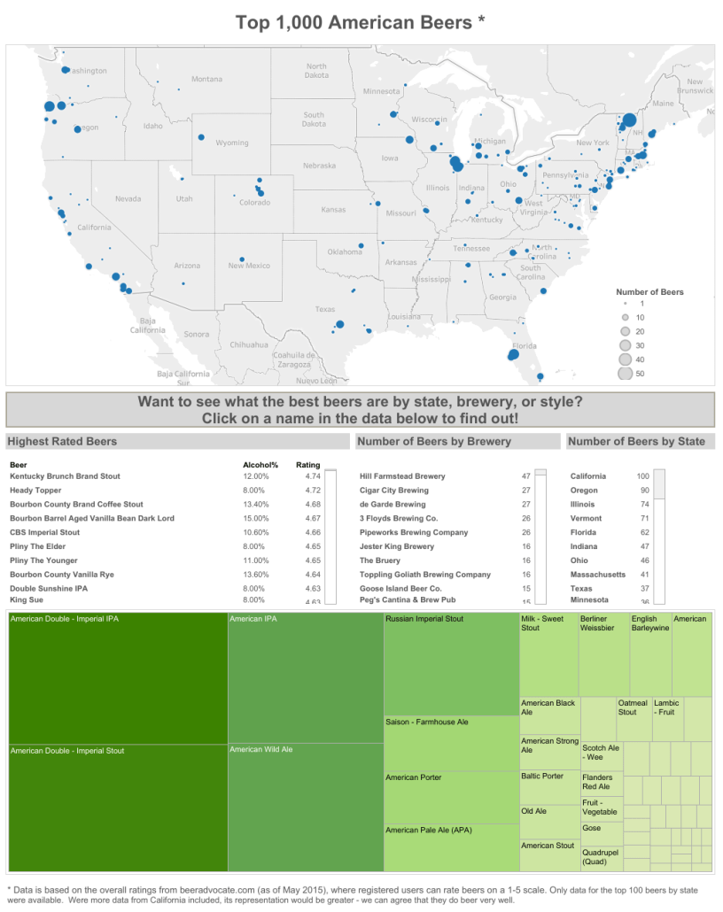
I was interested in seeing what beers other people were into, so I started scraping data from Beer Advocate, which had a list of the top 250 beers in America. At the time, I didn’t have great scraping skills (I still don’t, but that’s besides the point), so I did a copy/paste of the data into an Excel spreadsheet.
And then started cleaning. And cleaning. And cleaning. Because the beer name, style, brewery, ABV% (alcohol by volume %), and rating were all coming in on separate rows. But eventually I got that cleaned up, and loaded the Excel sheet into Tableau, and created a couple sheets that didn’t look too bad.

A good start, but I wanted something a bit bigger. Something that would show the parts of the country that make the best beer…like, you know…a map.
This brought up two problems. The first is, of course I didn’t want to just show it by state, I wanted to break it down further. Does southern California do it better than northern California? Cincinnati better than Cleveland? And the only way to do that was to find the zip codes for each brewery…by Google search..every, single, one of them.
That took a little time.
The second problem came when I loaded all that data and mapped it out. It was way too concentrated in a few areas of the country and didn’t represent a large amount of states. Could I leave it alone at this? No, I couldn’t. So I expanded the list to 1,000, lather rinse repeat on cleaning/searching/mapping.
But, the end result, pretty good…


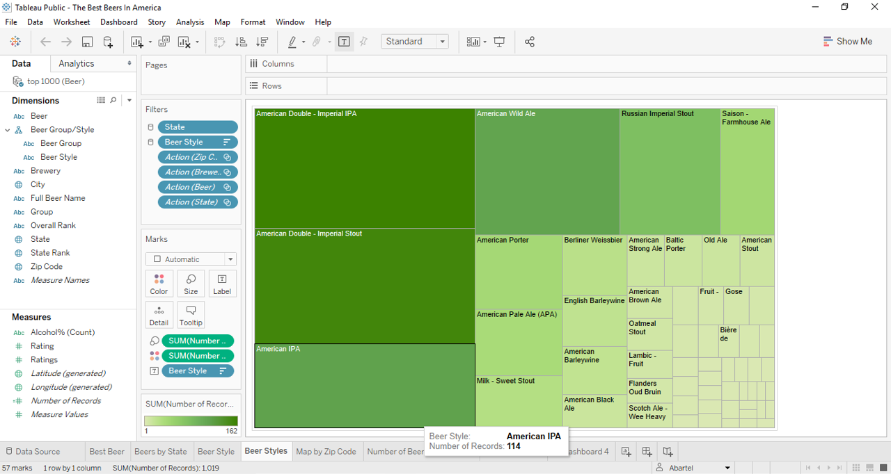
None of the tables are terribly complex, other than using filters for each sheet.
And yet, somehow, this made it to Viz of the Day. Granted, it was right before a holiday, so the competition might not have been as stiff, but a win’s a win!
Here’s what I like about this viz:
- I did it
- Lots of information
- Map tells a good story
- Heat map shows the kind of beers that people go nuts over
Here’s what could be improved upon:
- There’s a lot of information to digest, maybe too much
- Kind of boring
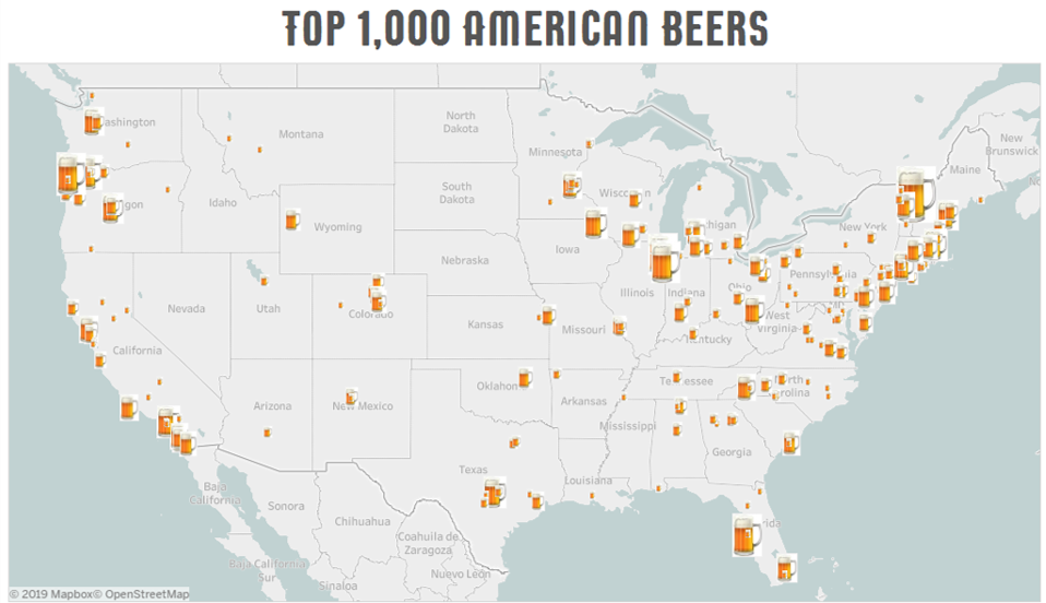
- The marks could have been beer mugs instead of circles
Now, the data source is long gone for this, but by adding in a custom font (I bought a package from Creative Images, but there’s plenty of good free fonts out there), darkening the map, swapping the circles for a custom mark, and removing the size legend, I came to a nicer map.

Incredibly interesting. Very well done!
Congratulations! Jon
LikeLike