(Dashboard referenced in the article)
In part 1 of the series, we explored downloading images without the annoying white background, and organizing them into shapes folders. In this part, we’ll explore how to create a dashboard box that organizes shapes, and adding reference lines to a chart to make them more useful (in this case, to create markers between league levels).
First thing you’ll need to do is create a parameter for the number of columns in the board, which I conveniently titled “Number of Columns”. I set 14 as the current value, which will set the…number of columns….

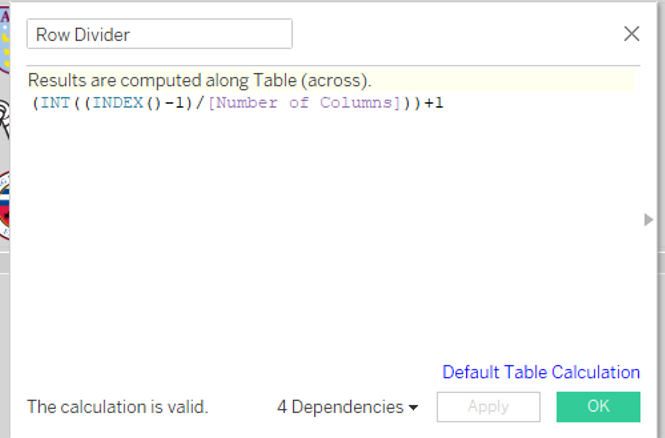
Once you’ve done that, you’ll have to create two calculated fields. I can’t explain what these do or why they do it, I just know you need them. Because I said so, don’t make me turn this car around!!

Once you’ve got these set up, you can build your worksheet. The end product will require you to move Column Divider to the Columns shelf, Row Divider to the Row shelf, change the Marks card to a shape, and drag Team into the Shape card.

The next thing you’ll need to do is click on the Shapes card. The Edit Shape screen will appear, and all of the teams will appear in the left column. From here, you’ll assign the logo to each team. Click the Reload Shapes button, then click the drop-down arrow under Select Shape Palette. If you created a custom folder, then it will show up as an option. See all the logos? Good job!!

From here, click on a team’s name, and then double-click on the corresponding logo, and it will set the appropriate picture to the team.
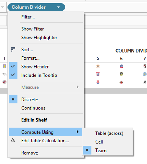
For each divider field, click the drop-down arrow and set the field as Discrete, and set it to computing on Team.
The last things you’ll want to do are to click on the Size card and adjust the size of the logos, adjust the row and column sizes, and then once you’re done, unclick the Show Header option (see above), and you’re set!
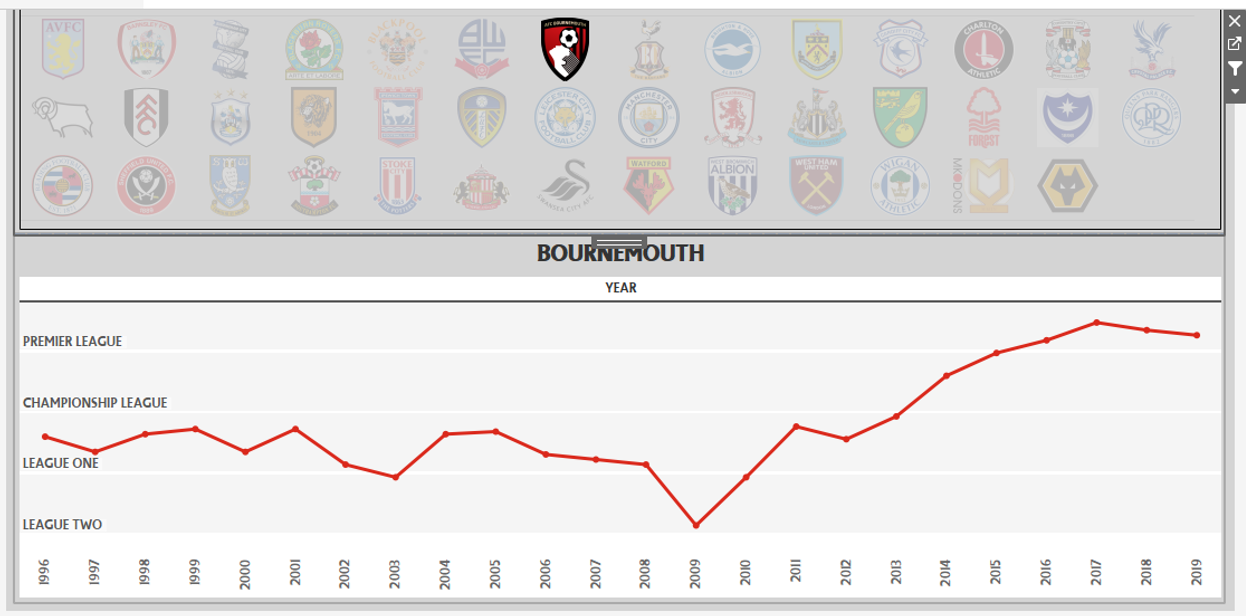
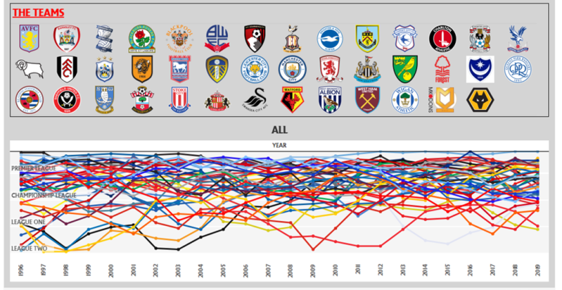
This logo table is going to work in tandem with a line chart that will display a team’s league position over time. The chart itself is pretty easy to pull together. Simply drag Year into the Column shelf, League Position into the Row shelf, and Team onto the Color card. Then click the drop-down to select a Line chart.
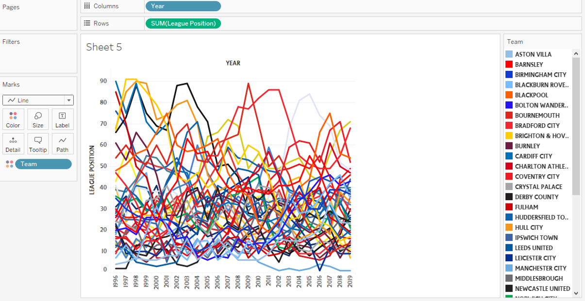
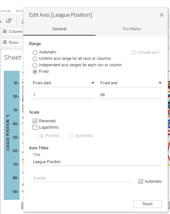
This is nice, but it really needs to have the lower numbers at the top, as they indicate a higher place in the standings. Plus, I don’t want to have 0 on the chart, since there’s no 0th place. So, I right clicked on the vertical axis, and selected Edit Axis. I then filled it out as shown below, changing the range to fixed, making the start value 1, and selecting the scale to reversed.
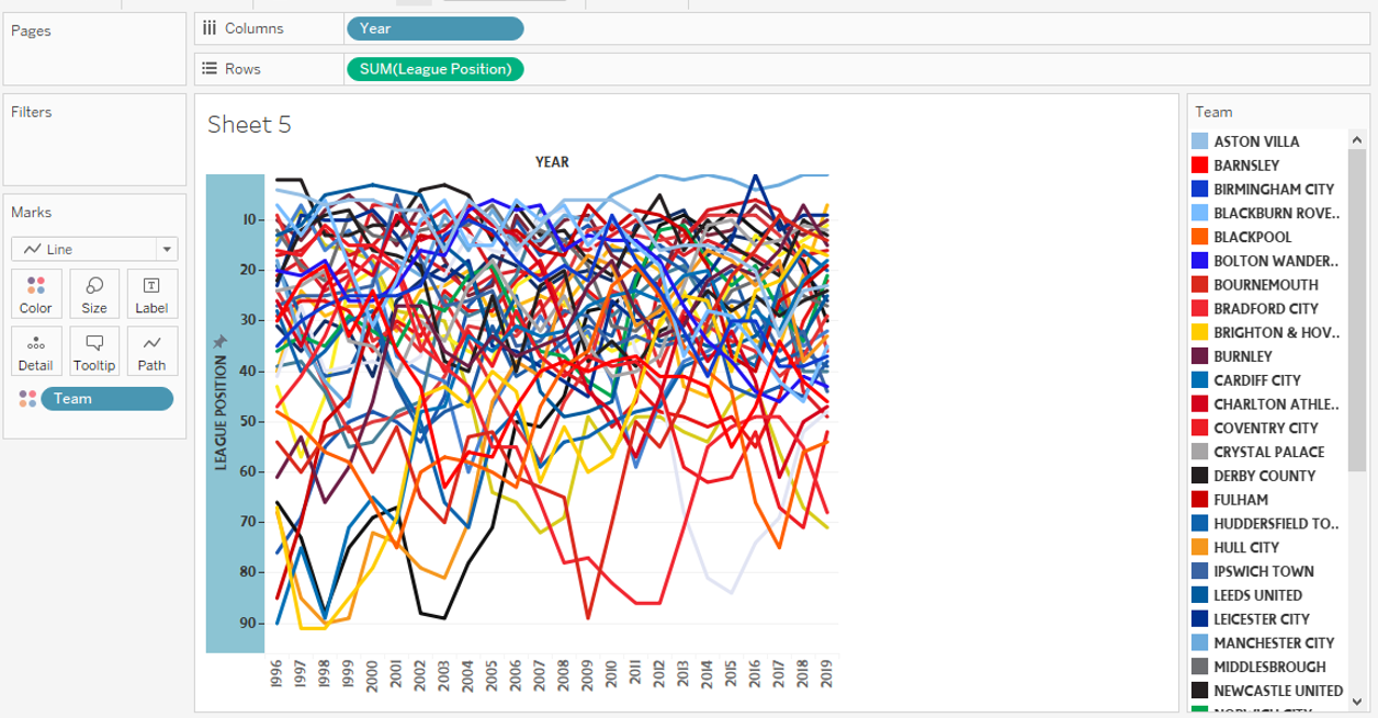
Better, but it still needs work.
What would be nice is if we could show some breaks to visualize each league. This is where reference bands can help. Click on the Analytics tab on the left, and drag Reference Band onto the chart. Then select Band, Per Pane, and set the Band From and Band To to constant values, and the Label in Band To to PREMIER LEAGUE.
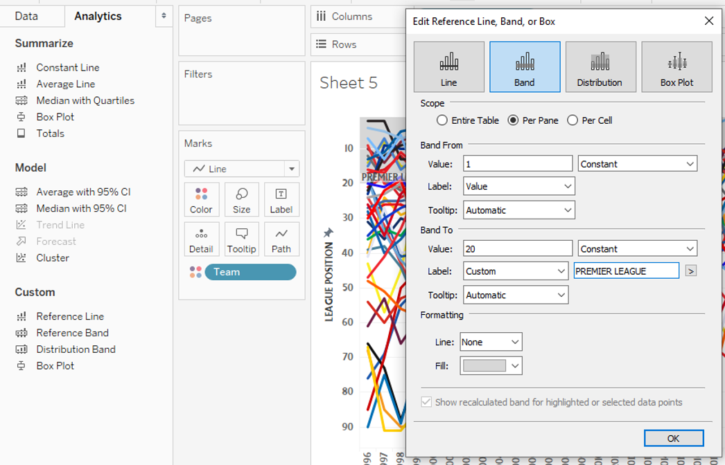
I created additional bands for each league (which created a space between each league, a happy accident), and hid the header on the vertical axis, and got to the below.

The last thing we need to do is to move this into a dashboard, and link it up with the logo table that we worked on before. Say you want to view the progress of Bournemouth. Click on their logo, and check it out.