(Dashboard referenced in the article)
This is part 1 of a 2 part series of posts that will show you how to accomplish various tasks in Tableau to create an interactive dashboard that filters on images, and creates a meaningful line chart. I had this all in one post, but it was incredibly long and made more sense to chop it up into pieces. Enjoy part 1!
As my lady loves to remind me, I’m one of those “weird” people that enjoy watching soccer, specifically English soccer (I’ve tried on MLS, but it just doesn’t do it for me).
One of the things that I find fascinating about English soccer – and probably every country outside of the US – is the structure of their leagues. England refers to theirs as the Football Pyramid. Each country has a top league (English Premier League, or EPL), second tier (Championship), and on down the line. After the fifth tier, multiple leagues exist on each tier, mostly because these are semi-pro or Saturday teams with part-time players that can’t afford to travel too far.
These league also institute the concept of relegation and promotion. The bottom teams (usually 3) are relegated to the tier below, and the top teams are promoted to the tier above (oftentimes the top 2 teams are promoted automatically, and 3-6 play in a 4 team playoff to determine the final team).
So, theoretically, no team is completely safe in their position, and any team has the opportunity to rise to the top of the pyramid.
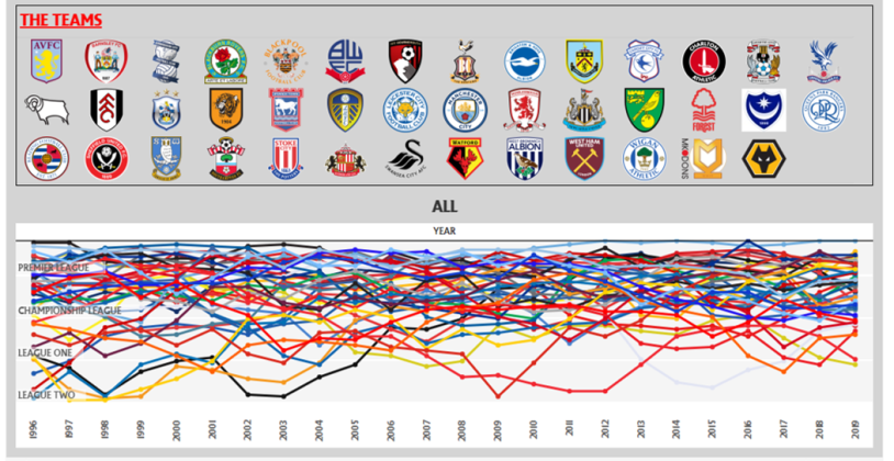
I wanted to see how the teams that were promoted fared in their post-promotion seasons, and how hard it might be for relegated teams to get promoted again. This entailed scraping a fair amount of Wikipedia pages, and then pasting them together into an Excel file to upload into Tableau.
There were some really interesting insights, which I simply laid out in text boxes. You can view the gory details of them in the dashboard if you’re really interested, but the overall takeaway is that your first season post-relegation or promotion has a large impact on your future success.
There were two ways that I wanted to make this dashboard stand out. The first was to use the custom font for the EPL (yes, the league does have an official font). However, I found that, while you can download a font to use in Tableau Desktop, the font won’t appear on the web version of the dashboard if it’s not recognized online. So, I decided to just use this font for the title, and create a picture of the title and paste it into the dashboard.

The other thing that I wanted to do was to use team logos as filters to show data specific to the team. I had a picture in my head of what I wanted it to look like.

This didn’t turn out as difficult as it was tedious.
First, download the pictures that you want to use as shapes. I only had to do this 41 times. But, I discovered something that I’d been struggling with before, and that’s using shapes that had unnecessary white shape surrounding the picture.
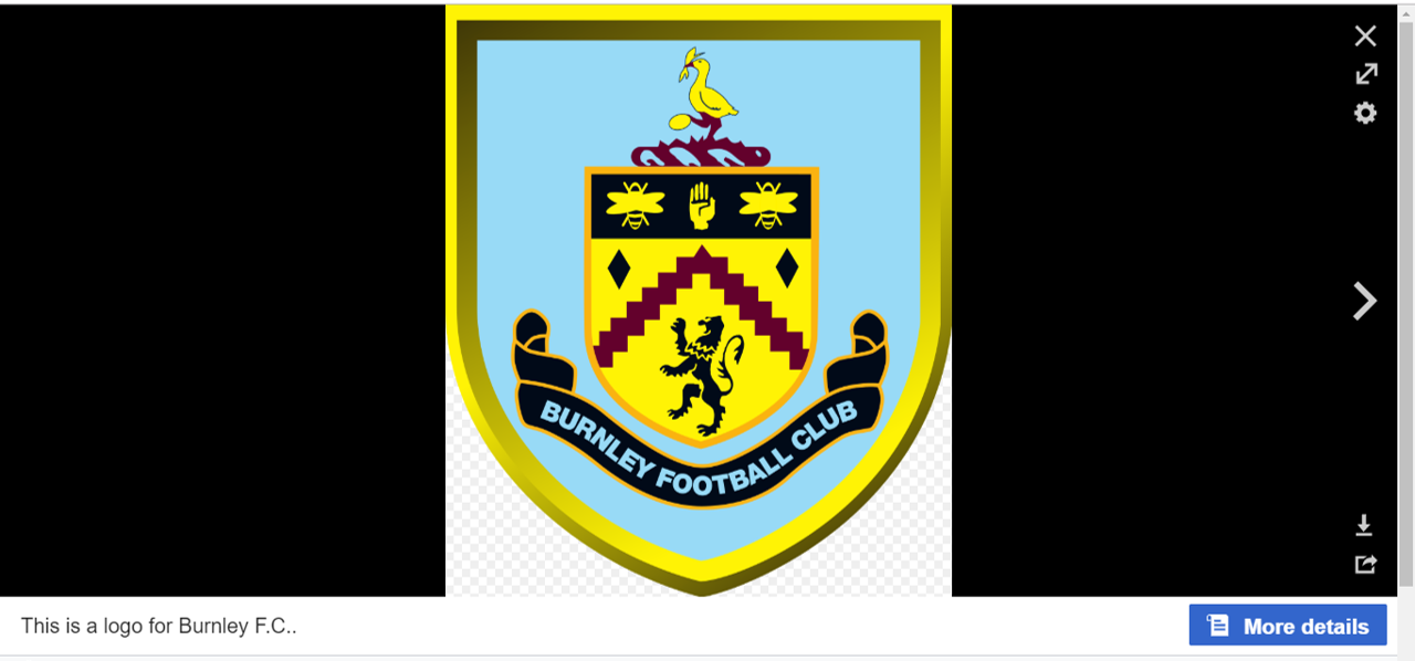
Here’s an example of what I did to download the logo for Burnley FC.
First, go to their Wikipedia page, and click on the logo.

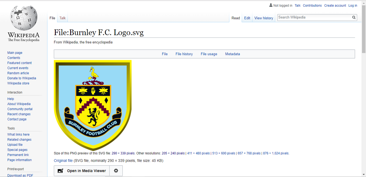
Next, click on the “More Details” box in the lower right corner.
From here, select the size of the picture that you want to use, then right-click on the image and save it in your My Tableau Repository > Shapes folder (I created a sub-folder for the logos, this will come in handy in a bit).
Now repeat that 40 times!
Once you’ve got the pictures saved, you can start to build the image board that I showed above.
