
(Dashboard referenced in the article)
This is an old dashboard (which is obvious from the selection of songs) that I built when I first started playing with Tableau. There’s no real technical learnings, but I think there’s a good argument to be made on visualization in general…and about Pandora.
Years ago (four to be exact), I used to listen to Pandora’s Top Alternative station when I was eating breakfast before work – yes, I am one of those people that actually eats breakfast before work. And I noticed that, in addition to the current alt-rock hits, there were quite a few songs that seemed way too old to be considered to be “current hits”.
Eventually I emailed Pandora, and asked them if they knew that Oasis and Green Day had hijacked their top alternative station. The response I got was something along the lines of “yes, we like to play all the top hits, but we occasionally like to throw in an older song for fun”.
This person probably thought I was the kind of person that would just leave it at that and not question it any further.
Oh, was she wrong.
OHHHH, SHE WAS SOOOOO WRONG!!
I was not going to take this lying down! No, I am right, and I am going to prove that I was right!
So, like absolutely no sane person would do, I spent the next 23 work days recording every song that the station played (I did not set out to end the recording at 23 days, I just got tired of logging them during breakfast and felt like I had a large enough sample size to create representative reports).
Some days I got more songs in, because I only required myself to record the songs, and not necessarily listen to them if I didn’t like them (looking in your direction, Vance Joy and Mumford and Sons).
After that was done, I had to lookup the date that each song peaked on the Billboard Top Alternative charts, because if I’m going to make my point, I have to show that some of these songs were really old. And this was a painstaking process, but, you know, all in the name of science.
Once I compiled the data and started playing around with it in Tableau, I quickly decided that it would be easier to calculate the time between the peak and the play date in the source data itself. Given enough time, I might have been able to do it in Tableau, but it was going to be messy, and I wasn’t looking to put together anything earth-shattering.
I pulled some quick tables together, and found that I recorded 481 songs over the 23 days. 481! That’s nuts! But, again, science.
Using a distinct count, I got to 154 unique songs, which is a fair sample size.
And then, I tinkered around with the various time measurements that I had calculated in the source data. Weeks since peak didn’t provide much analytical value, and months I ended up creating groups for (more on that in a minute). But years, once I started looking into the data, I found that 78 of the 154 songs had peaked more than a year prior to the play date.
Yep, more than half of the songs played on the top alternative station were more than a year old. Quite the definition of hot.
I created a few simple tables and dragged them into a dashboard, and showed the below:

Looking back now, I’m not sure the average lends much to the visualization, because the tail end should mostly be considered outliers. Don’t believe me?

So, yeah…
Another simple table showed the most played songs, and man, some of these did not stand the test of time (Coleman Hell, hello!)

Both of these are nice, but they offer no real context. To give that context, I’m going to need to put together a chart that shows the age of the songs as a part of the whole.
It became clear that the best way to display the data would be to group it into buckets. I ended up going with four:
- Within 1 month of peak – songs that were either on their way up the charts, or pretty much at their peak
- 1-6 months past peak – songs that were just starting to descend from the charts, or were still fresh enough to be considered top hits
- 7-12 months past peak – songs that had left the charts, but could still be considered for end of year shows
- More than 12 months past peak – songs that would range from “oh I remember that one, I liked that” to “hey, I think my dad has the poster from the tour when they first played this song”
After trying out a few options, I settled on the good old pie chart that everyone hates. I have a much longer post coming on the pie chart controversy, once I’ve completed that I will link to it here.
It didn’t take but a few clicks to get to this masterpiece:
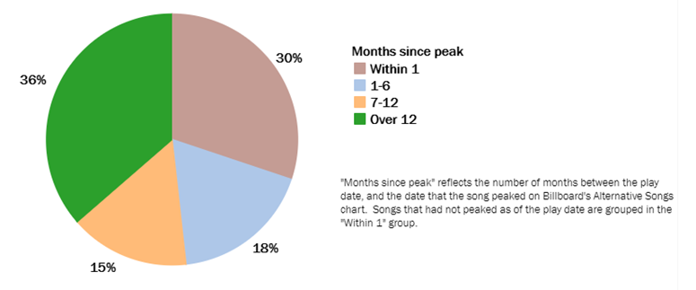
Could I have used another type of chart? Perhaps. Would it have shown more clearly that over half the songs on this station aren’t really current hits? In my mind, no.
