(Dashboard referenced in the article)
One of the things that I’ve grown interested in over the past few years is learning about police shootings, and what the underlying factors were behind them.
Data has long been difficult to come by, but the Washington Post has created a database that they built using local reports and other data sources.
I downloaded data from 2015-2018 (only data through 10/11/18 was available at the time I started working on this). The data is pretty robust – where the shooting occurred, was the victim fleeing, were they armed, etc.
After perusing the data, a few things jumped out at me:
- Body cameras only capture a small number of shootings
- Most victims are armed in some way, but
- Many of them were fleeing at the time of the shooting
- About 1 in 4 victims exhibited some level of mental illness
- Almost half of all victims were non-white
I first wanted to display those numbers as a whole, so I used some basic text boxes. I also felt it was worth creating a map (I love me some maps) to show where shootings per million were most prevalent.
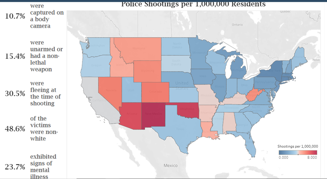
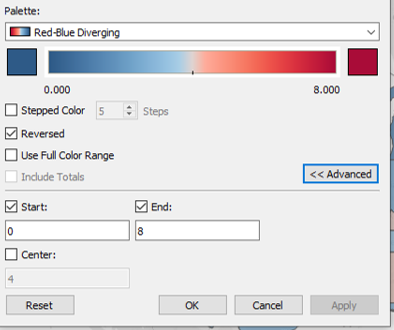
New Mexico and Oklahoma jumped out at me as being way higher than the rest of the country. I ended up having to reduce the top end of the range, because it was skewing the shading (both states are well above the 8 per 1,000,000 top end of the range as displayed).
(If you don’t know how to adjust the bottom/top ends of a range, it’s pretty simple. Double-click on the legend, then click the Advanced button, and the range will display below it.)
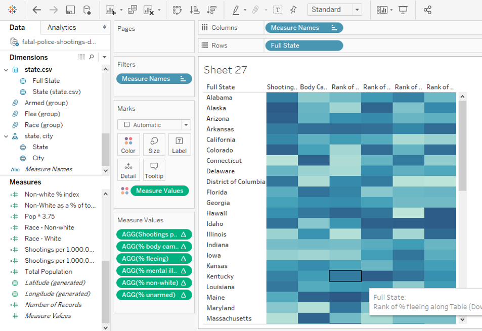
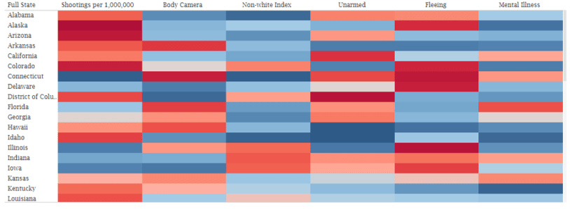
As I started to play with the details beyond the state level, I quickly saw that looking at just the raw numbers didn’t tell much of a story without viewing them in some sort of context. This led to the idea of ranking the states by measure, which quickly moved to the idea of a heat map.
Building a heat map using just one or two measures is pretty easy to do, since that’s an option in the Show Me section. Building one using multiple measures is simple as well, but it’s not as obvious on how to do it.
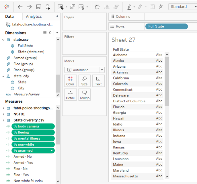
Here’s how I built mine. First, I dragged Full State (the field that contains the full name of a state, i.e. Alabama instead of AL) into the Rows shelf.

Then, I selected the fields that I wanted to use as the measures in the map, using the Shift key since they were all next to each other, and dragged them over the Abc area (there is another field I added later, I just didn’t want to deal with the Shift/Control potential issues) .
This brings in the raw data. From there, you will want to create a Quick Table Calculation that ranks each measure by state.
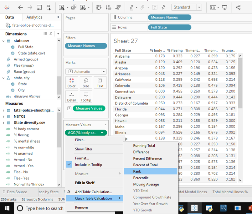
Once you’ve taken care of that, all you need to do is drag Measure Values onto the Colors mark, and remove that from the Text mark, and you’ve got a heat map!