(Dashboard referenced in the article)
A few weeks back, I was reading something about Silent Sam, the Confederate monument on the UNC campus that was toppled by students last year. It reminded me, also, that there are monuments in northern states, which was somewhat baffling to me. So I wanted to explore this further, and map out just where all of these monuments were.
A quick Google search led me to a dataset compiled by the Southern Poverty Law Center. After downloading, quickly cleaning, and uploading it to Tableau, I started to play with the data. I quickly realized that the visualization in my head wasn’t going to look nearly as good on my computer.
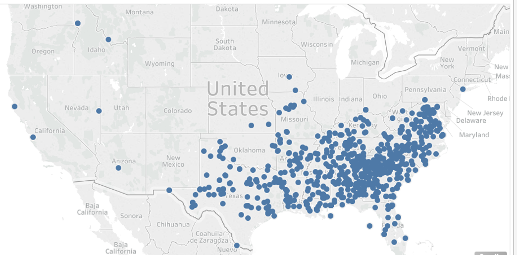
There weren’t nearly as many in the north as I’d thought, and the clustering in the south was way too tight to display anything meaningful.
Disheartened, I went back to the data to see what might be worth looking at, and I noticed a column titled ‘school_percentage_black’. Which struck me as an interesting item to look at; after all, it would seem kind of awkward to have a significantly black student body at a school named after Jefferson Davis or Robert E. Lee.
This is where I implemented a lesson that I wish I had learned a long time ago:
YOU DON’T HAVE TO USE EVERY SINGLE ITEM IN THE DATASET!!
Sure, I would be ignoring a large part of the data, but if I can’t tell a good story with that data, then it’s not worth using.
Anyways, a few quick map strokes, and a couple text boxes later, here we go:
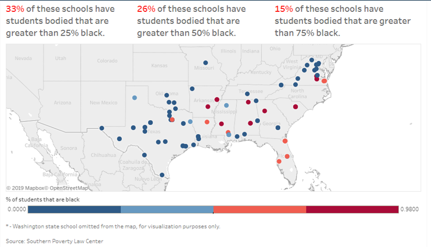
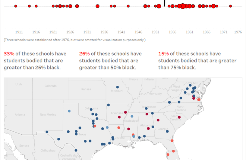
Not bad! I decided to go with four segments, as it’s hard to tell the story if the color trend is continuous. The text boxes also add an easy way for people to understand the data at a glance, instead of having to try and calculate it on their own.
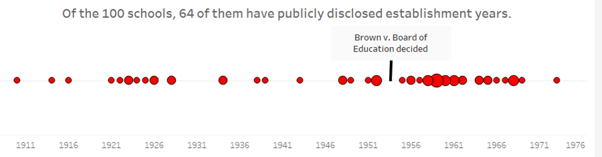
So that’s pretty cool. But then I looked at another column in the data, titled ‘year_dedicated’. A good deal of them have a value of ‘Unknown’, but the majority have a dedication year. All of those values are from 1910 forward…which is almost 50 years after the end of the Civil War. That seemed…weird?
I decided to create a timeline to visualize the trend of when these schools were dedicated. To do this, I used Ryan Sleeper’s guide on creating a timeline (there’s nothing wrong with stealing methods that others have utilized, we’re all in the same gang here). Feel free to review from his site if you’d like, but I’ll go through the steps below.
The first thing you need to do is create a calculated field, where you set the value as MIN(0). I called it ‘placeholder’ – you can call it whatever you feel like.
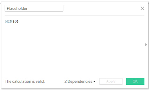
Then, drag the calculated field to the Rows shelf. This will create the horizontal line that will be used to place the data onto.

Drag the date field that you want to add to the timeline into the Columns shelf. Right-click on the field, and select Continuous – this will make sure that the timeline follows a…timeline…instead of treating each entry as having equal time periods between them.

The next few steps that I took were to add Year and Number of Records to the Detail shelf, and Number of Records to the Size shelf. The Number of Records steps are used to set the mark size to be related to the timeline – if you only want to mark dates, you can skip those steps.

Because there are outliers on the right that skew the timeline and will make it difficult to draw conclusions from, I filtered out those years.

You’ll also need to add a filter for Year based on Range of Dates. Why? This is one of those issues where the answer is “because Tableau said so”.

Once you’ve got this set up, all you need to do is change the Marks dropdown to Circle, and appropriately sized circles will appear!
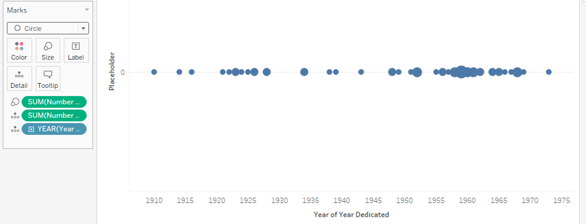
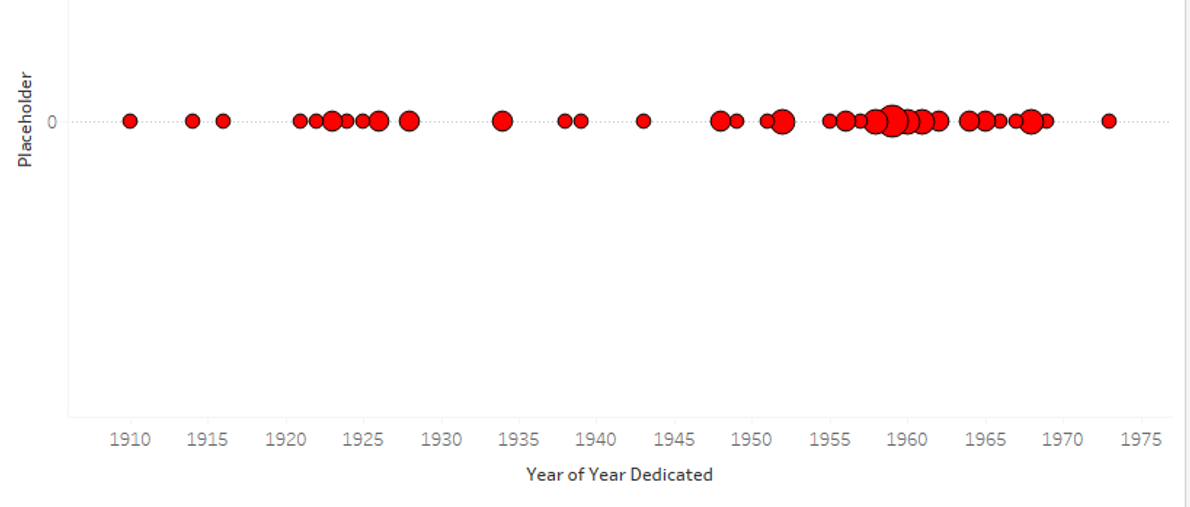
From there, I did a little formatting on the Color, by changing the background and border colors.
So I was all set, but then I noticed the clustering of marks on the right, most of them to the right of 1955. That rang a bell, but I couldn’t put my finger on…
Oh, that’s right, Brown v. Board of Education was decided in 1954.
That seems like something that should be called out with an annotation. Which is pretty easy. Just find the part of the line that’s around 1954, right-click, select Annotate > Point, enter the text, and…