Several months ago, I was asked if I wanted to join a fantasy hockey league.
I haven’t followed hockey regularly in years.
I don’t know anything about how to properly value players.
OF COURSE I WAS IN!!!
What am I, some sort of heathen?
But I had to do some extra prep, and I couldn’t just look at the basic counting stats to project their performance this year.
No, I had to dig deep into the advanced stats, find the impostors to avoid, and the diamonds in the rough to steal.
And what better way to do this than to build a Tableau dashboard to visualize everything? This is totally going to help me win the league!
(Spoiler alert: it did not. At all.)
But, in the process, I built what I think is a pretty slick dashboard, which I will go through in great detail at some point in the future.
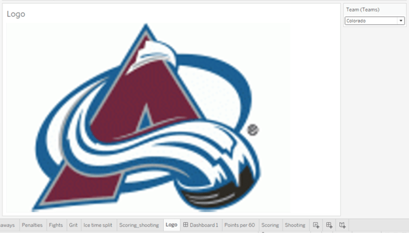
Today I want to take a look at one aspect of the dashboard that gave me a lot of trouble. The dashboard is filtered by team, and I really wanted to have the team logo appear and change as the fitler changed.
Luckily I took an online training class that showed how to place a custom image in a specific spot, and then found pieces from a few blogs to fill in the gaps to complete the puzzle.
So here it is, all in one spot.
First, create two calculated fields, one titled X-axis, and one titled Y-axis. Set the values of both to 1.
Then you’re going to take steps that are visualized in the picture below.
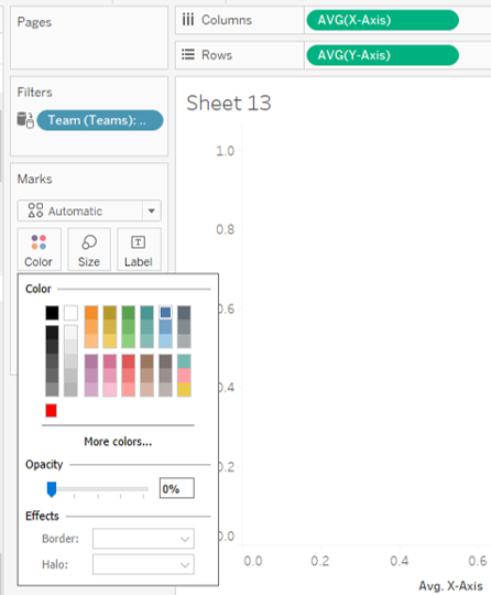
You’re going to place the X-axis field on the Columns shelf, and Y-axis on the Rows. Then change each one from SUM to AVG.
You’ll see a blue circle in the upper right corner. Click on the Color button on the Marks card and set Opacity to 0%, and the circle will disappear (don’t worry, it’s still there, it’s just invisible).
Next you’ll want to identify the field that will be tied to the filter. In this case, my field was ‘Team (Teams)’. Move that field both into the Filters, and drag it into the Detail button on the Marks card.
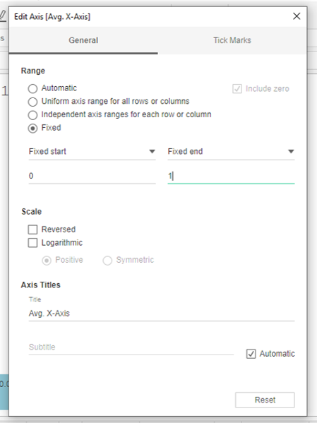
Then, right click on one of the axes, select the Edit Axis option, and then change the Range to Fixed. Make sure the start value is 0, and the end value is 1. Repeat for the other axis.
Download and save all of the images that you want to use. Crop and size them (I’m not gonna lie, you might have to redo this a few times along the way).
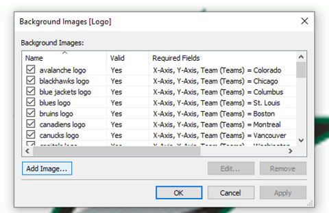
Then you’re going to click on Map, then select Background Images, and select the data source that contains the field you want to filter on (in this case I only have one data source).

This will take you to the below screen. You’ll click on the Add Image button.
You’ll take a few steps pictured below very quickly. First, click on the Browse button to upload the first picture you want to display. Then give it a title in the Name bar, and set the Right and Top values to 1.

Then click on the Options tab, and click on the Add button.
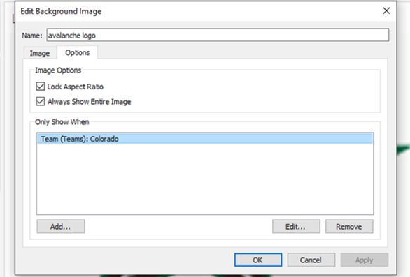
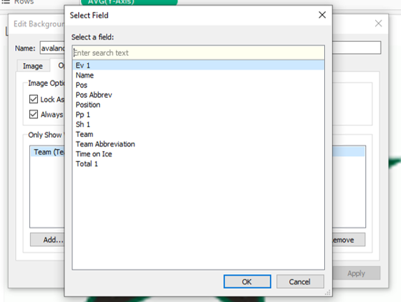
Next, select the Field that has the values in it that you want to filter on.
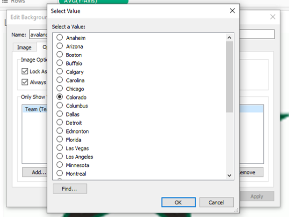
Finally, select the Value you want to link to tie to the picture.
Click OK all the way through. Repeat this process for every picture (only 30 more to go for me!)
(Also, I know it’s Vegas, not Las Vegas, it’s my workbook, and I’ll do what I want to. Do what I want to. Do what I want to.)
Show the filter, make your selection, and check out what you just did!

