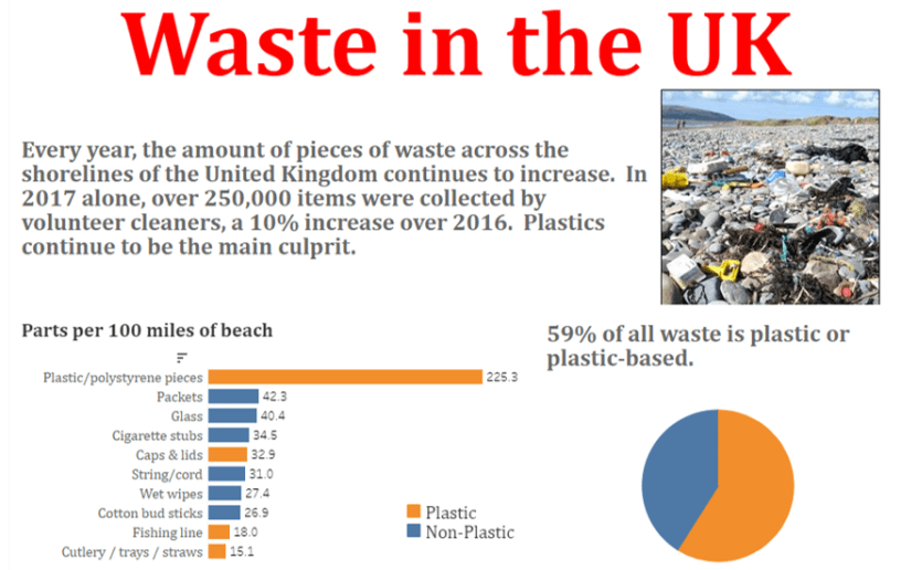
This week’s Makeover Monday picked a visualization from a BBC article concerning the plastic trash problems that the UK is facing. It’s so bad, the Marine Conversation Society identified 718 different pieces of trash for every 100m of shoreline of the beaches of the UK!
Every 100m!
718 pieces of trash for every 100 miles! That’s a lot of tra…
(holds finger to earpiece)
I’m sorry, I’m being told that the UK uses the distance measure of m for meters, not miles.
Oops!
(In my defense…there is no real defense)
But that’s even worse!
After I looked at the dataset, I quickly realized that I would be better off making a simple visualization and a couple charts with some text, instead of a bunch of drilldowns.
Why, you ask? There were only two columns and ten rows. So that made it an easy decision.
Since the focus of the article was on plastic trash, I felt that it would be best to make the plastic categories pop out, as opposed to all other pieces. Before I imported the data, I added a column to identify plastic and non-plastic trash (for a dataset this size, it wasn’t a big deal to do this – had it been a larger set, I would have created groups in Tableau).
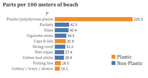
(This assumes that all caps & lids/fishing line/cutlery are plastic – let’s go with that)
Pretty basic stuff, but it’s hard to get a sense of the proportion of plastic products to all trash. Until…
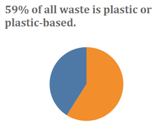
AAAAAHHHH PIIIIIE CHARTS RUN FOR YOUR LIFE AUNTIE EM IT’S A TWISTER!!
Look, if you’re just measuring two or three elements, there’s nothing wrong with using a pie chart. Anything over three and it starts to get messy.
I mean, if you really are anti-pie chart, you could do this as a stacked bar, and then pull out your tape measure to determine how many inches (sorry, millimeters) long each bar segment is. Or, you could put the values in the bar segments and clutter it up.
Or, you could just suck it up, make the pie chart, put a little text above it, and the reader can look at it and say ‘oh, that one piece takes up a little more than half the circle, that means it’s a little more than 50% of the total, but how much, oh look there’s text above it that tells me how much more than half! How informative, and I didn’t have to measure the screen!’
